Design Studio templates, styles and brand kit
Start from a template, change the look of a whole project with a style set, and keep every design on brand with your logo, colours and fonts. Includes the brand check that flags contrast and wording problems.
Templates
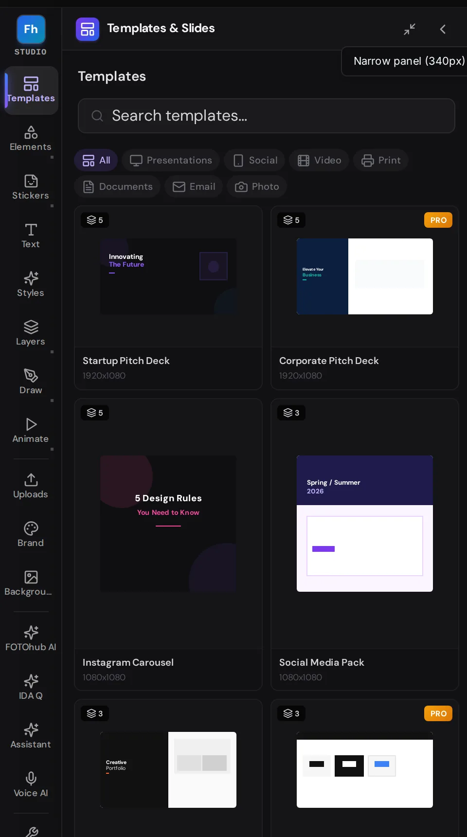
The Templates panel (Alt+1) is the fastest way from an empty page to a believable layout. Filter by All, Presentations, Social, Video, Print, Documents, Email or Photo, or search by name. Every card shows a preview, the name, the size (for example 1080x1080 or 1920x1080) and how many pages the template has. Cards marked PRO need a higher plan.
- Click a template card A preview window opens with the template's pages listed on the right, for example Instagram Post, Story and Facebook Cover for the Social Media Pack.
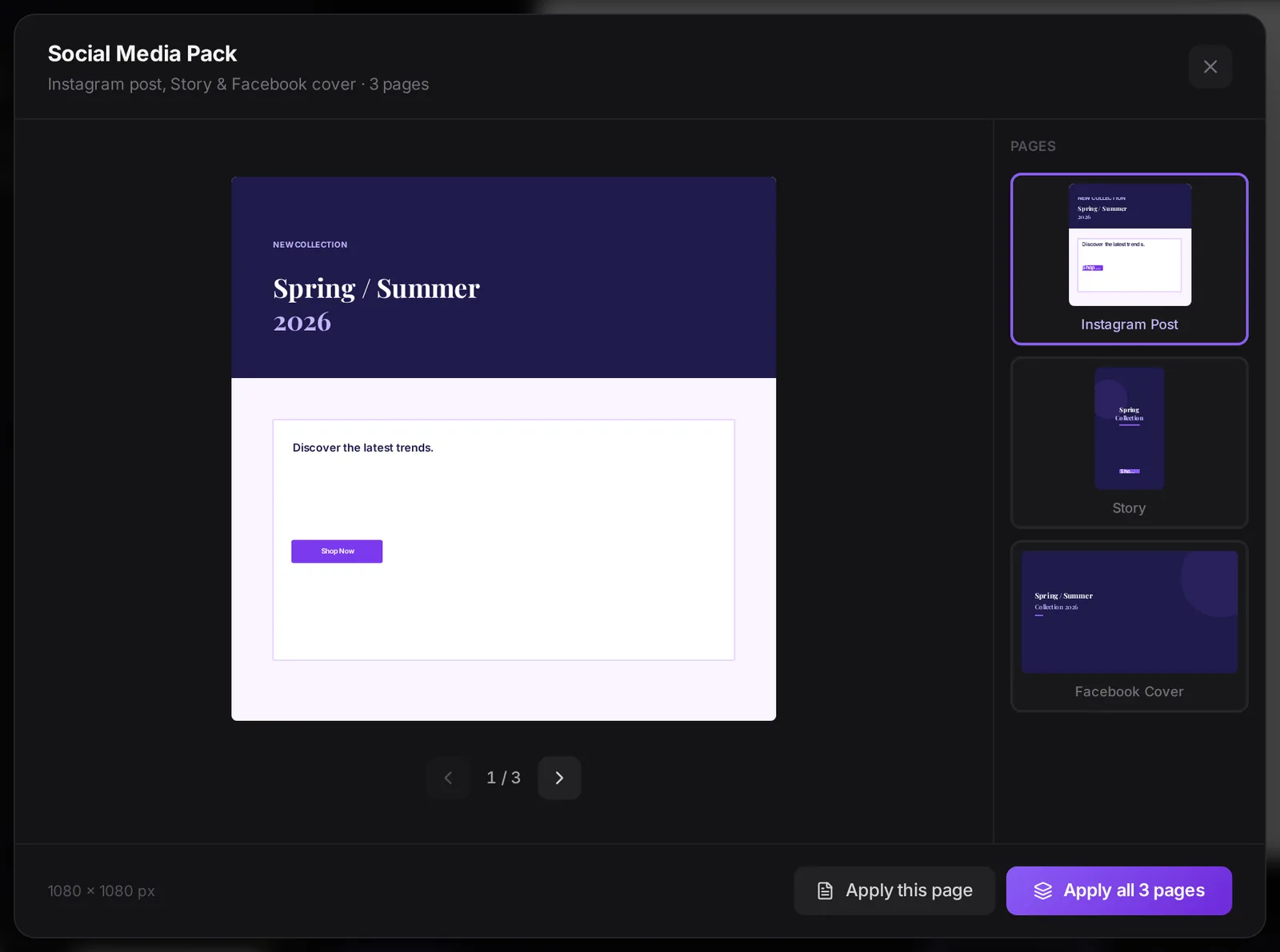
- Choose how much to apply Apply this page puts only the page you are looking at into your project. Apply all 3 pages brings every page. Use the arrows under the preview to browse.
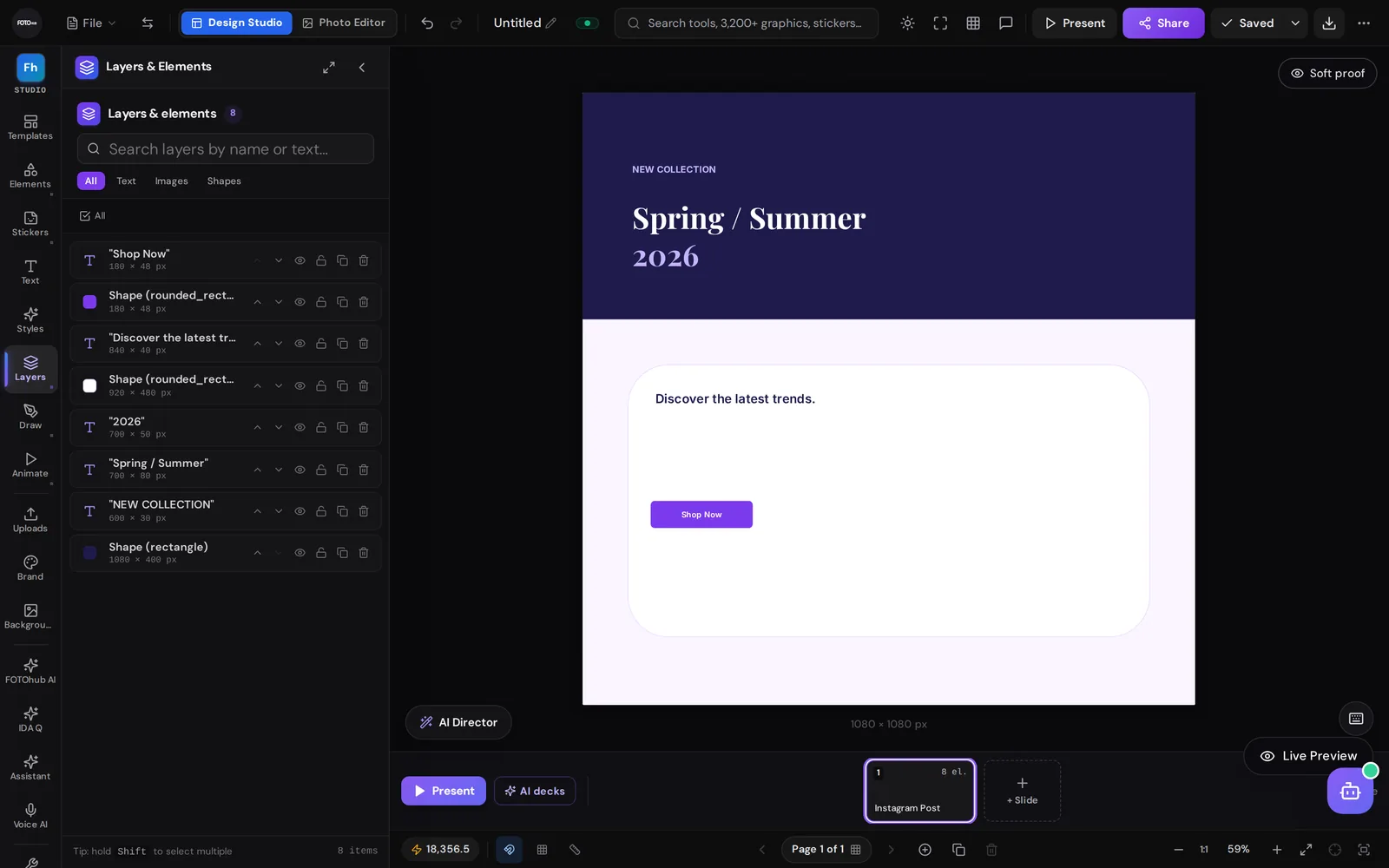
- Edit what arrived The template lands as ordinary layers: text, rectangles and rounded shapes. Open Layers to see them, double-click text to rewrite it, and change colours with the floating toolbar.
Styles: change the whole look at once
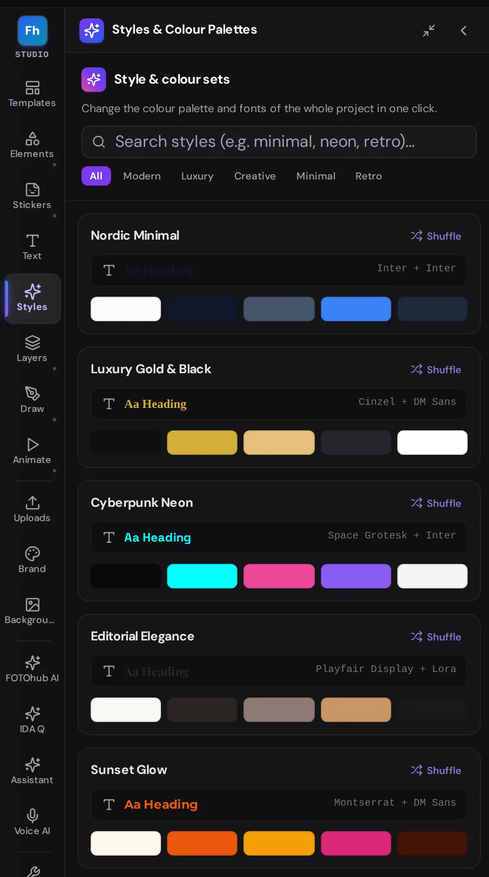
The Styles panel (Alt+S) changes the colour palette and the fonts of the whole project in one click. Sets are grouped as Modern, Luxury, Creative, Minimal and Retro, and each shows its colours and its heading and body fonts (for example Cinzel with DM Sans). Shuffle on a set tries another arrangement of its colours; a search box finds sets by words such as minimal, neon or retro.
Brand kit
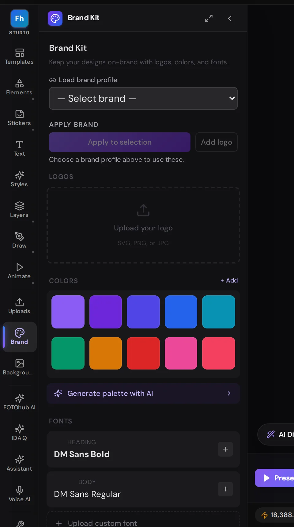
A brand kit keeps your logo, colours, fonts and photos in one place and makes them the easy choice in every design. Open it from Brand Kit at the top of the library, or from the Brand panel (Alt+4) inside the editor.
| Section | What you do there |
|---|---|
| Load brand profile | Pick one of your saved brand profiles. Then Apply to selection restyles the selected layers with it and Add logo places the logo (select objects on the canvas first). |
| Logos | Upload a logo as SVG, PNG or JPG. |
| Colors | A palette you click to add a colour to the canvas, + Add for your own, and Generate palette with AI. |
| Fonts | Heading and body fonts, and Upload custom font. |
| Brand photos | Add brand photos, or Import from website to build a brand kit from a site: colours, fonts, logo and tone of voice. |
| Brand check | Checks the page against the brand colours, fonts, logo clear space and banned phrases, plus contrast and text size. |
The brand check
After you load a profile, the check counts Errors, Warnings and Suggestions and lists each finding in plain words, for example "Text contrast is 2.1:1, below the required 4.5:1" with a suggested replacement colour and Show on canvas, which selects the layer concerned. Fix what matters, and re-open the panel to see the counts drop. The check is advice: it never blocks export.
Template, then style, then check
Goal. Turn a stock template into an on-brand post without redrawing anything.
| Setting | Value |
|---|---|
| Template | Social Media Pack, Instagram Post |
| Style | Luxury Gold and Black |
| Brand | a saved profile |
| Result | contrast errors listed with fixes |
Why it works. The template supplies the layout, the style set supplies the palette and fonts, the brand check supplies the safety net. Applying a style to a template that uses a dark text colour on a light panel can flatten the contrast, which is exactly what the check found on our run.
Open Design Studio templates, styles and brand kit in FOTOhub